
Textual Analysis of music magazine front cover- Billboard: Katy Perry
Denotation
The magazine front cover consists of a colour photograph of a woman looking directly at the camera. It is a mid to long shot which shows her head, arms, waist and thighs. She is standing in the centre and her upper thigh is visible in the shot. The background is a medium pink colour and covers the whole of the magazine cover. Behind the woman is the ‘Billboard’ masthead and in front there are 5 separate cover lines in black, white and yellow as well as puff with yellow and white text . The photographed woman’s name is in black and there are 4 yellow kickers with black explanatory lines.
Masthead
Billboards masthead is a very distinctive: Black with blue and green filled letters to add a pop of colour and vibrancy to the masthead – the colour of the masthead varies on every Billboard magazine cover to suit the different themes. The font used is a san serif font, telling us that it is a current and fresh magazine that is aimed at a younger audience age 15-26. The masthead is bold and striking and therefore is eye-catching to teenagers and young adults. The name ‘Billboard’ suggests that the magazine is about music and stays up to date with the charts as well as new music- this therefore grabs the younger audience’s attention as the magazine appears to be current.
Character
The cover photograph is a mid to long shot of the successful, diverse pop artist ‘Katy Perry’.
Costume
Her clothing is a floral and girly dress showing her arms and upper thigh. She also has flowers draped over her head and body which created a youthful feminine appearance. Her dress is short which could possibly appeal to a male audience yet it also will appeal to the female audience due to the young, elegant aspects of the costume.
Non-verbal communication
Her non-verbal communication is innocent yet in a sexualised way. She is looking directly at the camera-breaking the fourth wall. She looks sophisticated but the image has a fun, edgy look to it. She has a sultry image and she is displaying her vivid pink lips with her mouth opened slightly.
Lighting
The lighting is high key and could connote the spring or summer season to relate back to the floral theme which is emphasised by her outfit. This creates a happy atmosphere, portraying Katy Perry in a positive light.
Setting
There is little setting yet the background is a medium toned pink studio shot which relates back to the artists very feminine, elegant look as well as portraying her as a sophisticated artist.
Cover lines
The main cover line is printed in a serif font- contrasting with the san serif font of the masthead. This allows the main cover line ‘Katy Perry: Inside the court of the new queen of pop’ to stand out amongst the other 5 cover lines and could emphasise the serious nature of the article as serif fonts are more traditional. The kicker 'Katy Perry' informs viewers about who is featuring in the magazine without providing too much information which will hopefully intrigue the audience and influence them to buy the magazine. The large, bold font is also very effective at capturing people’s attention as the name 'Katy Perry' on its own will be successful enough at catching people's attention due to her large following. The explanatory line ‘New queen of pop’ is a reference to how successful her two songs ‘Fireworks’ and ‘Teenage Dream’ were as they incorporated a more edgy style into her songs which made them more dynamic and expanded her audience.
Secondary cover lines
The secondary cover lines inform us about how diverse the magazine is by mentioning artists such as ‘Eminem’ and ‘Sting’ on the magazine front cover. This may appeal to those who are interested in more than one music genre. The secondary cover lines are relatively small so the main cover line and the cover photograph stand out. This is a trend in the Billboard magazine front covers. All of the cover lines are a san serif font- keeping the magazine current and simple. One of the cover lines relate back to social media and therefore appealing to the younger generation who are in touch with the digital world.
The secondary cover lines make use of a kicker and an explanatory line.
The kickers are printed in yellow and are unusually smaller than the black explanatory lines- for example: ‘Beyond Farmville’ is the kicker and ‘Making money from Facebook social games’ is the explanatory line. This may have been done to inform the audience with more detail and encourage the audience to buy the magazine so they can find about more about the stories within the magazine. The use of yellow and black is also interesting as they create a bold yet elegant appearance.
Target audience
Considering all of these points, the likely target audience would be a combination of males and female aged 15-26 however females would most likely be the dominant gender amongst the audience. The younger audiences would have a good knowledge on the current pop artists and the culture as well as a definite interest in social media/latest technology.
Textual Analysis of music magazine front cover-Q: Cheryl Cole
Denotation
The coloured photograph consists of a woman looking directly at the camera. It is a close up shot which dominates the entire frame. The background is black and the masthead is on the left hand side of the magazine cover. The photographed woman’s name is in white and there are several cover lines. A bar code is visible on the centre of the left hand side, situated above a secondary cover line.
Masthead
Q is bold, simple and straight to the point. The name is memorable due to its short name. It consists of two bold colours- red and white which contrast each other well. It also gives the magazine an edgy look which will attract the younger audiences. It covers the main central image and emphasises the importance to the audience. The magazine was originally called ‘Cue’ in the sense of cueing a record.
Character
The cover photograph is of the successful British pop singer ‘Cheryl Cole’.
Composition
She is posed quite seductively which is achieved through her open mouth and Cheryl licking her ring. Her pose, body language and clothing are sexual and provocative.
Costume
She is wearing a leather jacket to emphasise that the rock genre is prominent in this magazine. This has been chosen carefully to appeal to the target audience of males as rock has the connotations of masculinity and portrays Cheryl as slightly rebellious as she is breaking the gender stereotype. She is also wearing a ring which could be seen as fierce due to the sharp shape and material- therefore linking back to the violent theme of rock. She appears to be wearing dark, smoky makeup which has been smudged by the water with bold red lips which is unusual for Cheryl Cole as she is a pop singer and this makeup associates her with the indie and rock genre as well as reinforcing the seductive and sexual appeal of this magazine. The water is also an unusual as it adds a dramatic effect to the image and stands out amongst the dull lighting- the water may be a reference to one of her songs called ‘Rain on me’.
Non-verbal communication
There is also sexual connotations of her non verbal communication. She is looking directly at the camera - a form of direct address - and is breaking the fourth wall as well as creating a sense of intimacy- personally connecting with the viewer and demanding the male target audience to buy the magazine. Her lips are parted which gives Cheryl Cole a very alluring look.
Lighting
The lighting is low key and dull which conveys the seductive manner of this magazine. The image is meant to display night time and may reflect the more rebellious side to Cheryl.
Setting
There is little setting however the background is plain black and although this was shot in a studio, we instantly assume she is outside as there is water which suggests she’s being photographed in the rain. This creates a dark atmosphere and gives the magazine a gothic theme which could have connotation of vampires and darkness - positioning Cheryl in a daring and rule breaking manner.
Cover lines
The main cover line ‘3 words: Cheryl Cole ROCKS’ is written on 3 separate lines in simple, uppercase san serif fonts (suggesting the magazine is current) with the colour of the font alternating between red and white which increase in size. The main cover line has been set out like this in order to be extremely eye-catching. The colours red and white are bold colours which contrast with the dark background that they are situated on and brings emphasis to the word ‘Rocks’. They also have the connotation of danger, aggression and power which may attract a certain type of audience. This intrigues the audience as we are curious as to why Cheryl Cole is being portrayed in this way. ‘Rocks’ is also very spaced out, therefore covering the bottom of the magazine cover which notifies us that it a significant part of this magazine. This may also have been done to highlight the popularity of the pop star. Older audiences may still recognise Cheryl Cole as a member of Girls Aloud and this main cover line helps emphasise how she has developed as a more dominant artist and how she now has a wider target audience. There is also a light shadow around ‘Rocks’ which brings more attention to the word and this could appeal to those who are interested in the rock genre. This is also a reference to her song ‘3 Words’.
The secondary cover lines are all in a san serif font, alternating in size and colour which is either red, white or grey which emphasise the consistency of the magazine as it matches the house style of the Q magazine. There are several cover lines which make the magazine look busy- this may intrigue the audience as the majority of the cover lines are about certain solo artists or bands and this will tempt the potential customers to buy the magazine. They may also be persuaded into buying the magazine as the audience may believe that the only way to stay up to date with the latest news is to purchase the magazine. The artists names have been capitalised to draw attention to the names and hopefully interest those who are fans of the artist. Reversed text has been used with a white background and coloured black or red font to highlight the significance of these artists and sells itself through celebrity endorsement. The unformed nature of the cover lines connotes a sense of rebellion and not following the rules therefore portraying Q magazine as more dangerous and daring.
Target audience
Considering all of these points, the target audience is likely to be a mix of male and female aged 17-25 who are interested in the rock and pop genre. Those who are interested in pop may want to purchase this magazine as Cheryl Cole is a famous pop star so her fans may be interested as to why she is being portrayed in a more rebellious way. However, the mise-en-scene conveys Cheryl as a rock artist and the provocative pose is aimed at males as the content on the cover can be seen as sexual. The younger generation may also be interested in this magazine as she is seen as contemporary.


July 2010
February 2010
Billboard masthead
Puff
Secondary cover- lines- Kicker and explanatory line
in a san serif font
Main cover-line -
Serif 'Katy Perry' kicker
with a white explanatory line
Main image- Long - mid shot
of Katy Perry
Yellow, black and white house style
Main cover line -
San serif 'Cheryl Cole' font
with a red serif explanatory line
Secondary cover lines -Juxtaposition of red, grey and white serif and serif fonts
Selling line
Q masthead
Puff
Barcode
Main image -Close up of Cheryl Cole
Q Magazine- Kings Of Leon October 2013
Music Magazine front cover analysis
- Q: KINGS OF LEON
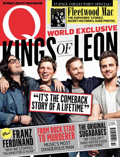
Cover lines
The first 3 cover lines which interested me are:
Franz Ferdinand “Why we stopped talking for a year”
From Rock Star To Murderer: Music’s most dangerous man
The Original Sugababes “We couldn’t have hated each other more”
These are interesting cover lines as the vocabulary that has been used is gripping and dramatic which instantly makes the audience want to read on to discover the full story.
'Franz Ferdinand “Why we stopped talking for a year” '
The contents page describes this article by saying ‘They called up a meeting in order to split up.. but came away with a magic recapturing album’ which can be found on Page 56. This grabs the viewers’ attention as it entices us to want to find out about the drama that the members of the group faced and excites the audience as they want to find out more about the new album. The word 'magic' also grabs the audience's attention as it portrays the album as unique and original.
'From Rock Star To Murderer: Music’s most dangerous man'
The contents page explains that this article is about ‘How a Norwegian musician went down for murder has now caught the attention of anti-terrorism police’ and is located on Page 70. This cover line really engages the audience as there is a dramatic and serious aspect to it which is also emphasised by the red bold san serif font to have an eye catching effect which stands out amongst the two other black cover lines as well as seeming current. This also suits the house style of the magazine Q, black, white and red,
The Original Sugababes “We couldn’t have hated each other more”
The contents page explains that this article is about ‘MKS: How the artists formerly known as the Sugababes buried pops biggest hatchet “We weren’t in KFC anymore” O.K. and is on Page 50 of the music magazine. This cover line also has a significant and serious aspect to it and interests the audience as the cover line suggests there is drama within the music industry. I could consider using cover lines like this to have an impact on my target audience.
This article matches with the front cover line and is what I was expecting it to be about. The article explains about the history and revolution of the Sugababes, informing us about how the ‘original’ members have reunited and developed their own band called MKS. The quote “We couldn’t have hated each other more” is also addressed within the article as we discover about the struggles that the group faced, why they split and how they overcame these to form the new group.
The main angle of the article is highlighting the return of the original Sugababes and how they have evolved as a group. I could consider using this idea for my dobule page spread article as it creates an exciting atmosphere due to the popularity of the group.
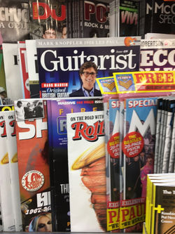
MUSIC MAGAZINES - SHOP SHELF
Magazines competing for attention
Importance of cover lines on the left hand side of the page
Music magazine conventions
Large, distinctive mastheads
Bold fonts
Competitions / offering
something interesting to the audience
'Free'
Large main image - Well known artists
to gain audiences interest
Main cover line, gripping and intriguing
- Important selling point
Reasonable cover prices to compete
with other magazines
Puffs to grab audience attention
House style and consistent colours
creating individuality and brand identity
 |
|---|
 |
 |