
Strengths and Weaknesses
DOUBLE PAGE SPREAD PHOTOS


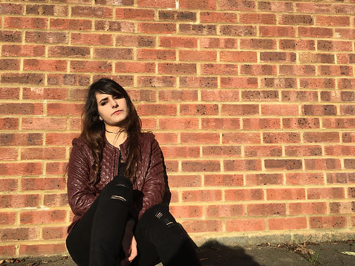

One of the strengths in my double page spread photos is the clear, natural lighting which has ensured that the photographs of my artists were clear and of a good quality which allowed my double page spread to look professional.
One of the weaknesses throughout these images is the shadow that was casted due to the strong lighting however this was easily experimented with and photoshopped out of the image.
Another strength is the use of a brick wall as the background as this created an urban and relaxed feel to my double page spread which linked well with the rebellious carefree representation of my artist.
A weakness of the double page spread images may be that although the lighting ensured my images were clear, it created strong contrast and created shadows around my artists face, possibly obscuring her facial expressions slightly.
One of my photographs strengths is the low angle mid - long shots which I have used and this has allowed me to ensure that my artists dark clothing and accessories are visible which will help the audience connect with the artist more as she appears to be confident within the shots. Despite this, a weakness of the photographs are that my artist doesn't have many props so people may not be able to associate her with a certain genre or style of music.
One of the strengths that my contents page images have is that my artist appears to be quite dominant in the frame as she is shot in the centre, making her appear bold and eye catching which I later emphasised through the use of layered filters to create a more vibrant and exciting effect.
The lack of props is the same weakness that can be seen in these set of photographs as you may not be able to connect the artist to a particular genre of music.
The background could have also been improved to create a more distinguishable setting such as a white or black background to give the effect of a studio shot or a clearer urban environment.
A weakness in this image is that my artist has her hands in her pockets and is wearing quite a dull outfit which makes the image appear extremely relaxed and careless as it is not common to see pop artists in extremely casual clothing, there is usually an element of styling behind the outfit. This can be contrasted with another image that was taken where the same was posed and dressed more appropriately in brighter colour a and is wearing sunglasses, making the image appear more interesting and different to my other photographs.
A weakness of my front cover images is possibly the lighting, although it is clear it initially appears to be dull and lack contrast which I decided to increase once using Photoshop.
A strength of my front cover images is the background as it was fairly clear and plain which allowed me to create the effect of a studio shot once editing. As a result, the photographs looked more professional and glamorous which was the aim of the front cover photographs as the images I used for my contents page and double page spread were more urban and casual. I decided I needed to include more formal and sophisticated photographs as this will allow my music magazine to appeal to a target audience of young adults.
A strength of my front cover photographs is that the red outfit matches the house style of my magazine which was suitable when using it on my front cover as the red from the masthead and cover lines created a consistent theme which I then developed by including colour such as purple and blue to match my contents page and create a distinctive house style.


