
I took the pictures of my artist for my double page spread in front of a brick wall as it has the connotations of an urban environment. As my artist is young, it also relates back to youth and the streets which is commonly associated with teenagers. I took multiple images to ensure that I had a range to choose from and it allowed me to experiment with different compositions to find the most suitable and interesting layout. I ensured that my artist was wearing dark clothing such as ripped jeans and boots which portrays the rebellious and carefree attitude of my artist which some of my younger target audiences may be able to relate to. As my genre is pop, I decided to add colour in such as red through the use of the headline which helps create a strong, bold contrast. The lighting of my photographs is high key set in the daytime which allowed me to ensure my images were of a high quality and clear. My artist is posed in a range of different ways however the most dominant pose in the photographs is where my artist is situated on the floor with a lack of eye contact made with the camera and this use of non verbal communication allowed me to convey her confident yet careless traits. A common theme throughout the photographs is the position of my artist, who is usually located to the left hand side of the photograph which ensures that I have space for my two columns of the text on the right hand side. I ensured to take a range of different photographs as this allowed me to create the correct composition.
I have experimented using different images to get a feel for how my double page spread could potentially look like. In this layout, I have decided to use the main image as the background. The artist is situated on the left hand side of the double page spread and she has strong non verbal communication as she is not making eye contact with the audience. Her body language is also quite careless and confident which is suggested by the way she is sitting and the composition of her arms which convey that she is dismissive and independent. This reflects my artist's personality which is why I chose this image to give me an idea of what my double spread page could look like. As she is looking to the right, our eyes are directed towards to the 2 columns of text which is an effective way of engaging the audience in the content. The artist is situated in front of a rough brick wall which is a natural, urban setting suggesting the individual herself is unpretentious and authentic. It also conveys her youth as she is located on 'the streets' suggesting she is daring and experimental.
I have placed the headline above the individual as it links to the artist's attitude directly below and the text looks effective against the brick wall setting as it could represent graffiti which is commonly associated with rebellious teenagers. Moreover, I have used a juxtaposition of font and font colour to suit specific words as well as making the artists name very distinctive. The headline 'Suzie Not So Sweet?' is an ironic title due to the artist's second name and gives the audience clues about the artist and content. I could consider using the headline 'The Return Of Suzie Sweet' as this is more specific to the content within the article and conjures an element of excitment, as seen on the Q Kings Of Leon' front cover page I analysed. In addition, I have overlapped two pieces of text which creates an interesting composition. The pieces of text on the left hand side of the double page spread have a white glow around them which causes them to stand out against the main image and draws our attention to the headline.
The stand first is located above the two columns of text and has been placed on a piece of scrap paper which ties in with the ideas within the article that the artist writes her own lyrics and connects the audience to the artist more.
The pull quote is situated in the centre of the two columns of text which allows the piece of text to look more interesting and has also been placed on a piece of paper to continue the theme of authenticity.
I have placed an image of an ink splat behind the text to allow it to stand out more against the brick wall background and also links to the idea of the artist writing down her own ideas and lyrics, giving the double page spread an edgy style.
On the left hand side of the double spread page, I have selected a handwritten font to represent the artist's signature which could connect the audience with the artist more as well as including smeared ink behind the font to create a rough and unrefined style. The text 'A* CONTENT' links to the theme of education within the article as the artist tries to manage her social life, education and passion for music however always prioritises music.
Once I take my own photographs, I can consider alerting the composition of the different elements to make sure they are suitable. I can also develop the fonts further to test out different styles and find the most appropriate font.


Layout 3 is different to the other layouts as the main image is not acting as the background as it covers the left hand page. The pull quote has been placed on top of the main image which could be an interesting composition as the image of the artist and the quote from the artist could help the audience connect to the artist's ideas and personality more. I have continued with the theme of two columns of text however the headline spreads across the two pages so the layout looks more relaxed.
This layout is similar to layout 1 however I have repositioned the pull quote and added in a small additional column of text. This will allow the double page spread to look busier and attention grabbing. The pull quote has been placed above the first column of text which may instantly grab the audience's attention before reading the article and give the reader an idea about what to expect. The standfirst has been placed under the headline as the ideas within the headline and standfirst link together and instantly provide more detail.

Layout 3
Layout 2
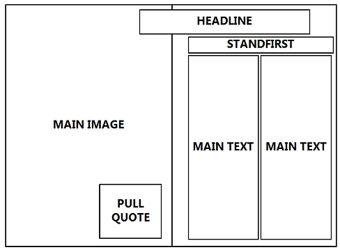
Layout 1
Draft double page spread layout
double page spread PHOTOGRAPHS

